What this guide is for
This guide is about health and disease. The first half explains what causes disease, how infectious diseases spread from person to person, what raises a person’s risk, and how our surroundings (the air, the water, the climate, the chemicals around us) affect our health. The second half is about evidence: how to read a health graph, how a good health experiment is set up, why two things happening together does not prove that one causes the other, and how to judge a health claim you read or hear.
The GED Science test asks about both. It asks what you know about health, and it also asks you to read data and judge scientific claims. The second half of this guide builds those reading skills.
This is one of three parts of a single long study guide on the human body. Each part is its own page:
- Part 1: Homeostasis and Feedback. How the body keeps the conditions inside it steady.
- Part 2: The Body Systems. The major systems one at a time, including the immune system, which fights infection.
- Part 3 (this page): Health, Disease, and Reading the Evidence.
Goes with: Look Again Quiz 18: The Immune System · Look Again Quiz 20: Food and Health · Life Science: Start Here, Part 7
In this guide:
- Two kinds of disease
- How infectious diseases spread
- Risk factors and prevention
- Environmental health
- Epidemiology: tracking disease in a population
- Reading and interpreting graphs
- The scientific method in health research
- Correlation and causation
- Kinds of health studies
- Evaluating health claims
- Check yourself
Two kinds of disease
This part of the guide looks at how diseases arise, how they spread, and how they are affected by our surroundings. This knowledge matters for understanding public health (the health of a whole community), and for reading the health data that appears on the GED Science test.
Diseases fall into two large groups, depending on whether they can spread from person to person.
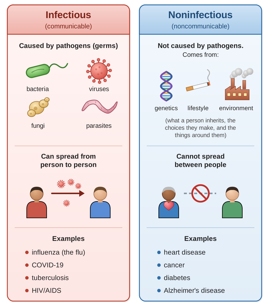
Infectious (communicable) diseases are caused by pathogens: germs, meaning bacteria, viruses, fungi, or parasites (living things that live on or in another living thing and harm it). These diseases can spread from one person to another by several routes. Examples include influenza (the flu), COVID-19, tuberculosis, and HIV/AIDS (HIV is the virus that causes the disease AIDS).
Noninfectious (noncommunicable) diseases are not caused by pathogens and cannot spread between people. They come from genetics (what a person inherits from their parents), from lifestyle choices, or from things in the environment. Examples include heart disease, cancer, diabetes, and Alzheimer’s disease.
An important difference between countries: In wealthier countries such as the United States, noninfectious diseases, especially heart disease and cancer, are the leading causes of death. In many poorer countries, infectious diseases are still a major cause of death. The difference reflects access to clean water, sanitation (safe removal of sewage and waste), vaccines, and health care.
Think it through. What is the difference between infectious and noninfectious diseases? Give two examples of each.
Show a model answer
An infectious disease is caused by a pathogen (a bacterium, virus, fungus, or parasite) and can spread from person to person. Examples: influenza and tuberculosis (also COVID-19, HIV/AIDS, malaria). A noninfectious disease is not caused by a pathogen and cannot be caught from another person; it comes from genetics, lifestyle, or the environment. Examples: heart disease and cancer (also diabetes, Alzheimer’s disease).
How infectious diseases spread
Knowing the routes by which a disease travels is the key to stopping it. Here are the main routes.
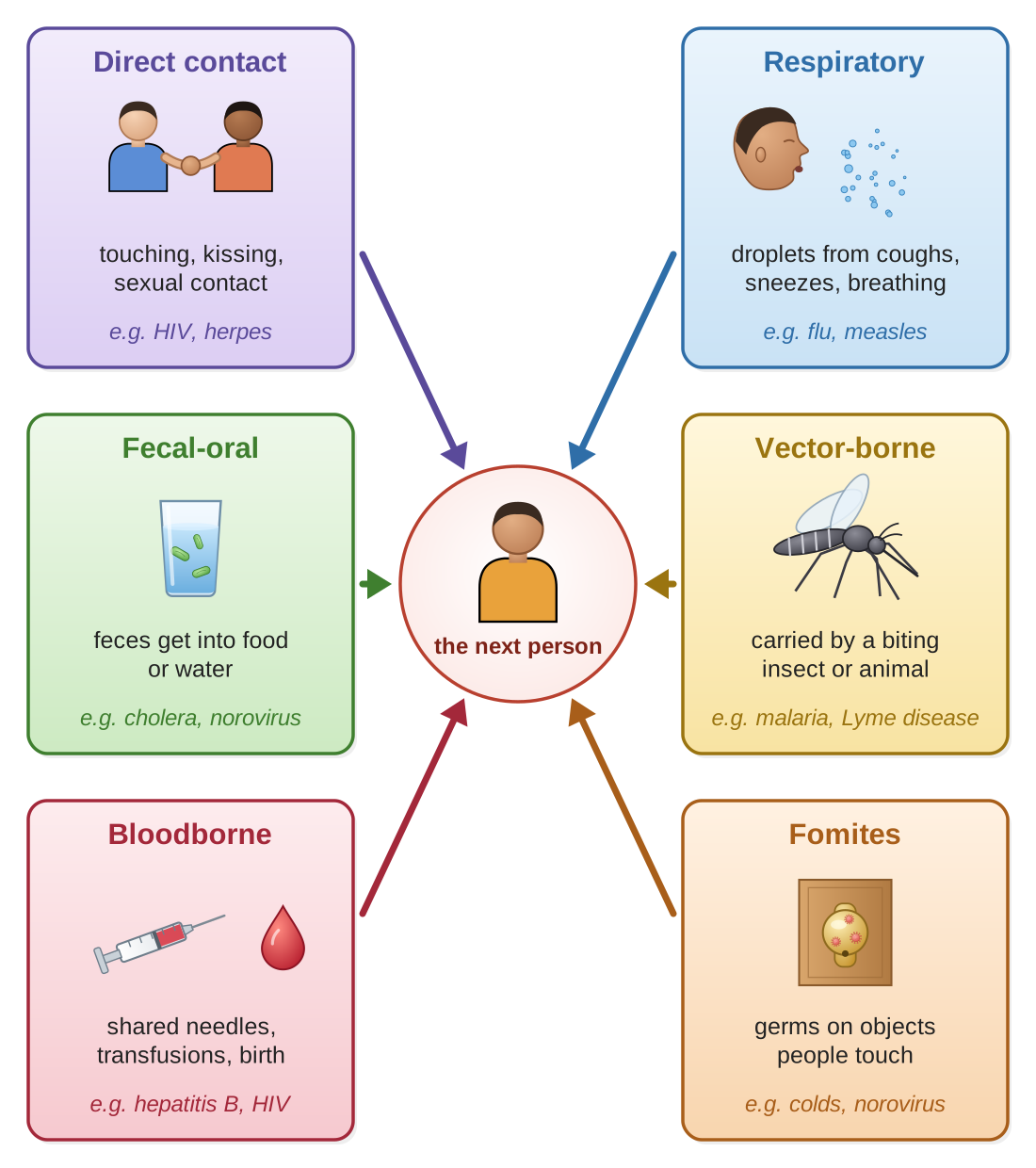
Direct contact: physical contact between an infected person and a susceptible person (someone who can catch the disease). This includes touching, kissing, and sexual contact. Examples: HIV, herpes, COVID-19 (through close contact).
Respiratory (airborne): pathogens travel in tiny droplets sent out by coughing, sneezing, or even breathing. Some can stay floating in the air. Examples: influenza, tuberculosis, COVID-19, measles.
Fecal-oral: pathogens from feces (stool) get into food or water, which someone then eats or drinks. This often comes from poor sanitation or poor hand washing. Examples: cholera, hepatitis A, norovirus.
Vector-borne: pathogens are carried by insects or other animals, called vectors, that pass on the disease when they bite. Examples: malaria and Zika (carried by mosquitoes), Lyme disease (ticks), plague (fleas).
Bloodborne: pathogens spread through contact with infected blood: through shared needles, through blood transfusions, or from mother to child during birth. Examples: HIV, hepatitis B and C.
Fomites: a fomite (FOE-mite) is an object that carries germs, such as a doorknob, a phone, or shared equipment. Pathogens on the object spread when people touch it. Examples: cold viruses, norovirus.
Breaking the chain of transmission
Transmission means the passing of a disease from one person to another. You can think of the spread of a disease as a chain: the pathogen, the route it travels, and the next person it reaches. Disease prevention aims at the links in that chain. Break any one link, and the disease stops spreading along that path. Ways to do this include:
- Vaccination: makes people immune (protected, so they do not get sick from the pathogen), which shrinks the number of people the disease can reach.
- Hand washing: reduces fecal-oral spread and spread by fomites.
- Masks and ventilation (bringing fresh air into a room): reduce respiratory spread.
- Vector control: mosquito nets and insecticides (insect-killing chemicals) reduce vector-borne diseases.
- Safe water and sanitation: prevent fecal-oral spread.
- Safer sex (such as using condoms) and needle exchange programs (which give people who inject drugs clean needles in exchange for used ones): reduce bloodborne and sexually transmitted infections.
Think it through. Name three ways infectious diseases can spread, and one prevention strategy for each.
Show a model answer
Any three of these, for example: Respiratory spread (flu, measles) can be reduced by masks, fresh air, and vaccination. Fecal-oral spread (cholera) can be prevented by safe water, sanitation, and hand washing. Vector-borne spread (malaria) can be reduced with mosquito nets and insecticides. Others: bloodborne spread (hepatitis B) is reduced by needle exchange and screening donated blood; fomites (norovirus) by hand washing and cleaning surfaces; direct contact (HIV) by safer sex.
Risk factors and prevention
A risk factor is anything that makes it more likely that a person will develop a disease. Some risk factors can be changed; these are called modifiable risk factors. Others cannot be changed; these are non-modifiable.
| Modifiable (can be changed) | Non-modifiable (cannot be changed) | Diseases these factors affect |
|---|---|---|
| Smoking Diet Physical activity Alcohol use Sun exposure | Age Sex (male or female) Genetics and family history Ethnicity (family ancestry) | Heart disease Type 2 diabetes Many cancers Stroke |
Read each column as its own list: the table does not pair one factor with one disease. Each of these diseases is affected by several of the factors.
You cannot change your genes or your age, but changing lifestyle factors can greatly lower your risk of disease.
For example, cigarette smoking is linked to about 80 to 90 percent of lung cancer deaths in the United States, so not smoking removes the largest single risk for lung cancer. Regular physical activity also lowers the risk of heart disease; many large studies find the risk is roughly 20 to 40 percent lower in people who are active.
Think it through. What is the difference between a modifiable and a non-modifiable risk factor?
Show a model answer
A modifiable risk factor is one a person can change, such as smoking, diet, physical activity, alcohol use, or sun exposure. A non-modifiable risk factor is one a person cannot change, such as age, sex, genetics and family history, or ethnicity.
Environmental health
The environment, meaning everything around us, has a strong effect on human health.
Air quality
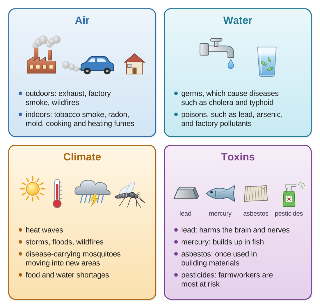
Outdoor air pollution: car and truck exhaust, factory pollution, and wildfires release particulate matter (tiny bits of soot and dust small enough to be breathed deep into the lungs), ozone (a gas that, near the ground, irritates the lungs), and other poisonous chemicals. Breathing polluted air over many years raises the risk of lung disease, heart disease, and cancer.
Indoor air pollution: tobacco smoke, radon gas, mold, and fumes from cooking and heating can be more concentrated indoors. Radon is a radioactive gas that comes up naturally from the ground and can collect in basements and lower floors. Radon is the second leading cause of lung cancer, after smoking.
Water quality
Contaminated water can carry pathogens (causing diseases such as cholera and typhoid) or poisonous chemicals (such as lead, arsenic, and factory pollutants). Bringing clean water to people is one of the most important achievements of public health, and the lack of clean water is still a major health problem around the world.
Climate and health
Climate change affects health in several ways:
- Heat waves: illness and death caused directly by heat, especially among older people.
- Extreme weather: injuries, and people forced from their homes, because of storms, floods, and wildfires.
- Vectors moving into new areas: mosquitoes carrying malaria and dengue (a virus that causes high fever and severe pain) are spreading into places where they were not found before.
- Food and water shortages: droughts and floods damage farming and water supplies.
Toxins and chemical exposure
People are exposed to thousands of chemicals made by industry. Some whose effects on health are known:
- Lead: a neurotoxin (a poison that damages the brain and nerves), especially harmful to children; it causes developmental delays, meaning a child learns and grows more slowly than expected.
- Mercury: a neurotoxin that builds up in fish; harmful to a baby developing in the womb.
- Asbestos: causes lung cancer and mesothelioma (a cancer of the thin lining around the lungs and other organs); it was once widely used in building materials.
- Pesticides (chemicals that kill insects, weeds, and other pests): their effects depend on the type; farmworkers are at the highest risk.
Think it through. How can climate change affect human health?
Show a model answer
Heat waves cause heat illness and death, especially among older people. Storms, floods, and wildfires cause injuries and force people from their homes. Mosquitoes that carry diseases such as malaria and dengue spread into new areas. Droughts and floods damage farms and water supplies, leading to shortages of food and clean water.
Epidemiology: tracking disease in a population
Epidemiology (ep-ih-dee-mee-OL-uh-jee) is the study of how diseases spread and are distributed in populations: who gets sick, where, when, and why. Here are key terms you may see:
- Prevalence: the total number of cases of a disease in a population at a given time, old and new together. It answers, “How common is this disease?”
- Incidence: the number of new cases during a period of time. It answers, “How quickly are new cases appearing?”
- Epidemic: an outbreak of a disease that affects many more people in a region at the same time than would normally be expected.
- Pandemic: an epidemic that has spread across many countries or continents.
- Endemic: a disease that is always present in a population or region (such as malaria in some tropical areas).
Suppose a neighborhood has 2,000 people living with diabetes this year, and 150 of them were first diagnosed this year. The prevalence is 2,000 (everyone who has the disease now). The incidence for this year is 150 (only the new cases). (These are made-up numbers, for practice.)
Correlation and causation: just because two things happen together (a correlation) does not mean one causes the other. To show that one thing causes another, scientists need controlled studies that rule out other explanations. This difference comes up often on the GED, and it is explained in full in Section 8 below.
Think it through. What is the difference between prevalence and incidence?
Show a model answer
Prevalence is the total number of people who have a disease at a given time, counting both old and new cases; it tells you how common the disease is. Incidence counts only the new cases during a period of time; it tells you how quickly new cases are appearing.
Reading and interpreting graphs
The GED Science test does not only ask you to remember health facts. It also asks you to read and interpret data, judge scientific claims, and use the scientific method. The rest of this guide builds those skills.
Health data is often shown in graphs and charts, and reading them accurately is essential. Figure 4 is a practice graph with made-up numbers. The numbered markers match the first steps in the list below it.
Reading a graph, step by step
- Read the title. What is this graph about? The title tells you the subject and often the time period.
- Check the axes. What does each axis measure? Pay close attention to the units: is it a number per 100,000 people, a percentage, or a plain count? The y-axis (the vertical one, up the side) usually shows the dependent variable, the thing being measured. The x-axis (the horizontal one, along the bottom) usually shows the independent variable, often time or categories. (Section 7 explains these two kinds of variable.)
- Find the trend. A trend is the overall direction of the data. Is it going up, going down, staying about the same, or going up and down? Look at the whole pattern, not just single points.
- Note any changes. Are there sudden jumps or drops, or turning points? These often match real events that are worth looking into.
- Look at the scale. Does the y-axis start at zero? An axis that starts higher than zero (a “cut-off” axis) can make small changes look dramatic. Always check.
Common kinds of graphs in health data
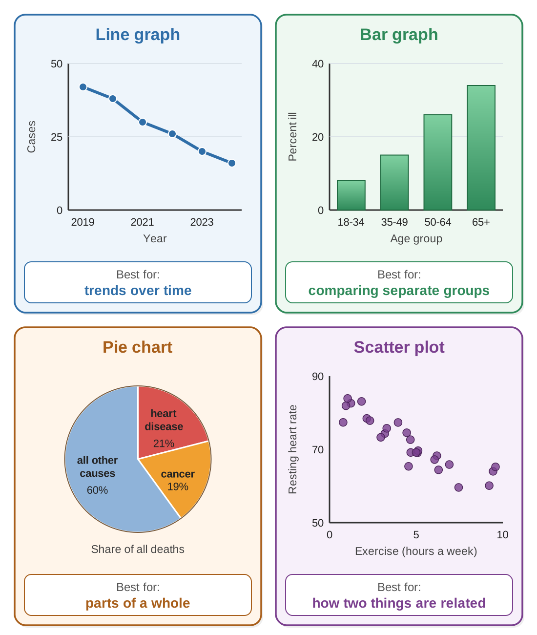
- Line graphs show trends over time. They are best for data that changes smoothly over time, such as death rates or the number of cases of a disease over the years.
- Bar graphs compare categories. They are best for separate groups, such as disease rates by age group, by country, or by type of treatment.
- Pie charts show parts of a whole. They are best for showing shares, such as each cause of death as a percentage of all deaths.
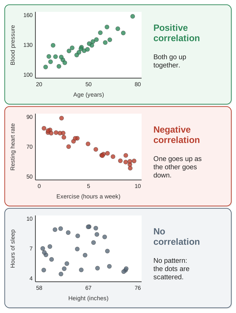
- Scatter plots show the relationship between two variables. Each dot stands for one observation (one person, one city, one measurement). Look for a pattern: a positive correlation (both go up together), a negative correlation (one goes up as the other goes down), or no correlation.
Think it through. When you read a graph, what should you check first? What do the x-axis and y-axis usually show?
Show a model answer
Check the title first, to learn what the graph is about and the time period. Then check the axes and their units. The x-axis (horizontal) usually shows the independent variable, often time or categories. The y-axis (vertical) usually shows the dependent variable, the thing being measured. Also check whether the y-axis starts at zero.
The scientific method in health research
Reliable health knowledge comes from the scientific method: a careful, step-by-step way of testing ideas.
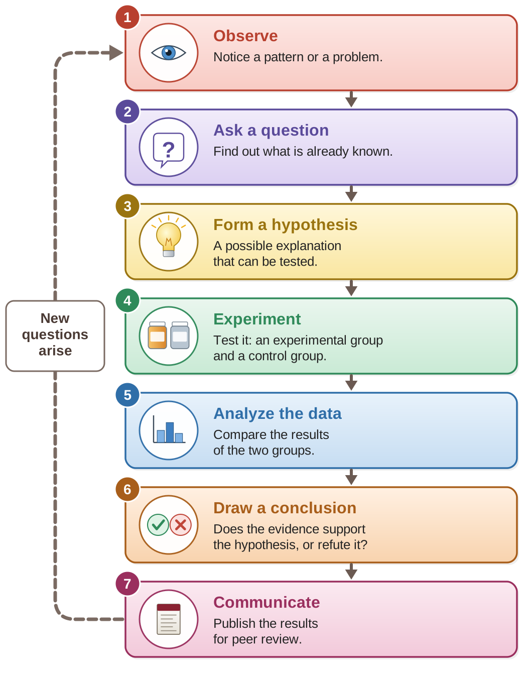
What a good experiment needs
- Control group: a group that does not receive the treatment being tested. It gives a baseline, a starting point to compare against. Without a control group, you cannot know whether changes were caused by the treatment or by something else.
- Experimental group: the group that receives the treatment. By comparing the results of the experimental group and the control group, researchers can measure the treatment’s effect.
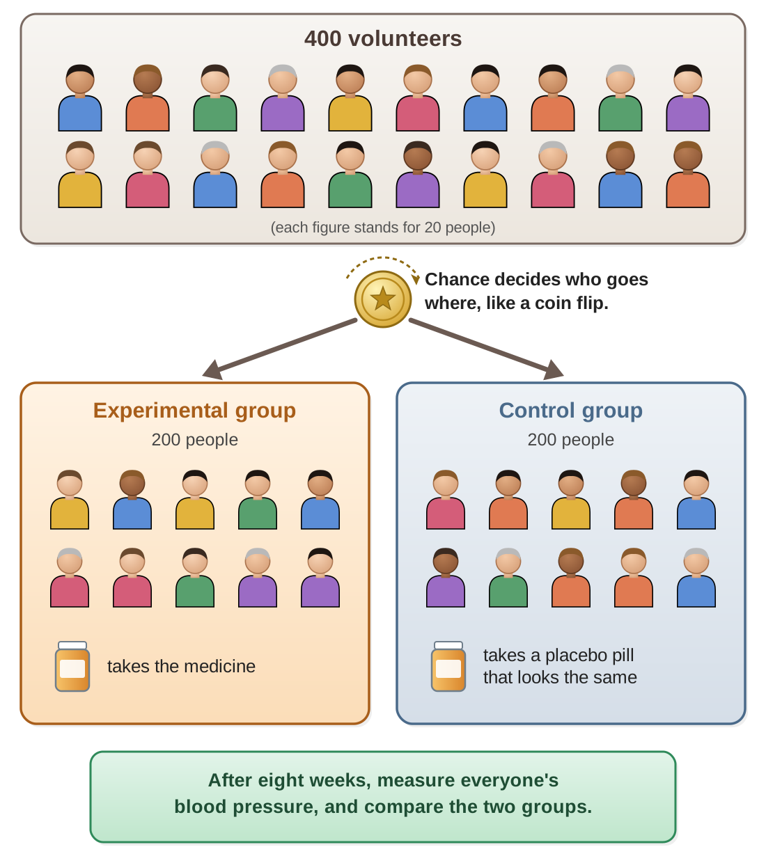
- Random assignment: people are placed in groups by chance, as if by flipping a coin. This makes it likely that the groups are alike in other ways, and it reduces bias (anything that unfairly tilts the results in one direction).
- Blinding: in a single-blind study, the participants do not know which group they are in; in a double-blind study, neither the participants nor the researchers know. To make this possible, the control group is often given a placebo, a fake treatment such as a sugar pill that looks like the real one. Blinding keeps people’s expectations from affecting the results.
- Sample size: the sample is the group of people in the study. Larger studies are generally more reliable; small ones can give misleading results just by chance.
Variables (the things in an experiment that can change):
- Independent variable: what the researcher deliberately changes or controls (the treatment).
- Dependent variable: what is measured as the outcome (the effect).
- Controlled variables: factors kept the same for all groups, so the test is fair.
Researchers want to know whether a new medicine lowers blood pressure.
They randomly assign 400 volunteers to two groups. The experimental group takes the medicine; the control group takes a placebo pill that looks the same. Neither the volunteers nor the researchers know who got which (double-blind). After eight weeks, they measure everyone’s blood pressure. The independent variable is the medicine (given or not). The dependent variable is blood pressure. Controlled variables include the length of the study and the time of day the pressure is measured. (This example is made up, for practice.)
Think it through. Why is a control group necessary in an experiment?
Show a model answer
The control group shows what happens without the treatment, so it gives a baseline to compare against. People can get better or worse on their own, or because they expect to. Only by comparing the treated group with an untreated (or placebo) group can researchers tell whether the change was caused by the treatment itself.
Correlation and causation
This is one of the most important ideas for judging health claims, and one of the ideas the GED tests most often.
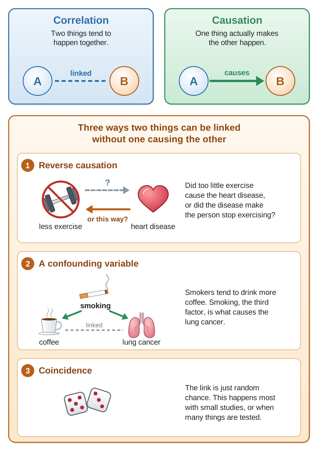
Correlation means two things tend to happen together. When one goes up, the other also goes up (a positive correlation), or the other goes down (a negative correlation).
Causation means one thing actually causes the other to happen.
The critical point: correlation does not prove causation. Just because two things are linked does not mean one causes the other. There are three common explanations for a correlation without causation:
- Reverse causation: maybe B causes A, instead of A causing B. Example: people with heart disease may exercise less. But did the lack of exercise cause the disease, or did the disease cause them to stop exercising?
- A confounding variable: a third factor causes both. Example: drinking coffee is correlated with lung cancer, but that is because smokers tend to drink more coffee. Smoking, the confounding variable, is what causes the lung cancer.
- Coincidence: the link is just random chance. This happens especially with small samples, or when researchers test many different things and a few links turn up by luck.
Think it through. What is the difference between correlation and causation? Give an example of a correlation that is NOT causation.
Show a model answer
A correlation means two things tend to happen together; causation means one actually makes the other happen. Example: ice cream sales and drowning deaths rise and fall together, but ice cream does not cause drowning. Hot summer weather causes both: more people buy ice cream, and more people go swimming. (Another example from this guide: coffee drinking is linked to lung cancer only because smokers tend to drink more coffee.)
Kinds of health studies
Different kinds of studies have different strengths and weaknesses.
| Kind of study | What it does | Strength and weakness |
|---|---|---|
| Randomized controlled trial (RCT) | People are randomly assigned to a treatment group or a control group. | The best method for showing cause; but costly and slow. |
| Cohort study | Follows a group of people over time, and compares those who were exposed to something (such as smoking) with those who were not. | Good for studying uncommon exposures; can take years. |
| Case-control study | Compares people who have a disease (the cases) with people who do not (the controls), and looks back at their past. | Good for rare diseases; depends on people’s memories, which can be wrong (recall bias). |
| Cross-sectional study | A snapshot of a population at one point in time. | Quick and inexpensive; cannot show cause, or which came first. |
Important: randomized controlled trials are called the “gold standard” for showing that something causes something else, meaning they are the best method, the one others are measured against. The reason is random assignment: it spreads all the other factors (age, habits, health) evenly between the groups, so those factors are very unlikely to explain the result. The other three kinds are observational studies: researchers watch and record what people already do, without assigning anyone a treatment. On their own, observational studies can usually show only a correlation.
Think it through. What makes randomized controlled trials the “gold standard” for health research?
Show a model answer
In an RCT, people are assigned to the treatment or the control group by chance. That spreads other factors, such as age, diet, and smoking, evenly between the groups, so a confounding variable is very unlikely to explain the result. With a control group (often given a placebo) and, ideally, blinding, any difference between the groups can be put down to the treatment. That is why an RCT can show cause, while observational studies usually show only a correlation.
Evaluating health claims
When you meet a health claim, in the news, online, or on the GED, ask these questions:
- What is the source? Peer-reviewed scientific journals (journals that publish only work checked by other scientists) are the most reliable. Be skeptical (doubtful until you see good evidence) of claims from companies selling a product, or from people without scientific training.
- What kind of study was it? Randomized controlled trials give stronger evidence than observational studies. Studies done on animals may not apply to humans.
- How large was the sample? Small studies can give misleading results. Look for studies with hundreds or thousands of participants.
- Has it been replicated? To replicate a study means to repeat it and get the same result. A single study is not proof. Look for findings confirmed by several independent studies.
- Is correlation being mistaken for causation? Many headlines claim that one thing causes another when the study only found a correlation. Look for the actual design of the study.
- What are the limitations? Good scientists say what their study cannot prove. Be wary of claims presented as absolutely certain.
- Who paid for the research? Studies paid for by people or companies who would profit from a certain result may be biased. That does not mean they are wrong, but they deserve extra checking.
Warning signs in health claims
Be skeptical when you see:
- Claims of a “miracle cure” or a “breakthrough.” Real science usually moves forward in small steps.
- Personal stories (“It worked for me!”) instead of data.
- Claims that doctors and scientists are “hiding” the truth.
- No mention of any scientific studies.
- Pressure to act right away or to buy something.
Think it through. List three questions you should ask when you evaluate a health claim.
Show a model answer
Any three of these: What is the source? What kind of study was it? How large was the sample? Has it been replicated? Is a correlation being presented as causation? What are the study’s limitations? Who paid for the research?
The terms in this guide
Pathogen A germ that causes disease: a bacterium, virus, fungus, or parasite.
Infectious (communicable) disease A disease caused by a pathogen that can spread from person to person.
Noninfectious (noncommunicable) disease A disease not caused by a pathogen, which cannot spread between people.
Vector An insect or other animal that carries a pathogen and passes it on, usually by biting.
Fomite An object, such as a doorknob or phone, that carries germs from one person to another.
Risk factor Anything that makes a disease more likely. Modifiable factors can be changed; non-modifiable ones cannot.
Epidemiology The study of how diseases spread and are distributed in populations.
Prevalence The total number of cases of a disease at a given time.
Incidence The number of new cases during a period of time.
Epidemic / pandemic / endemic An unusually large outbreak in a region / an epidemic across many countries / a disease always present in a region.
Independent variable What the researcher changes (the treatment). Usually on the x-axis.
Dependent variable What is measured as the outcome. Usually on the y-axis.
Control group The group that does not receive the treatment; the baseline for comparison.
Placebo A fake treatment, such as a sugar pill, given to the control group.
Correlation Two things tend to happen together.
Causation One thing actually makes the other happen.
Confounding variable A third factor that causes both of two things, making them look linked.
Randomized controlled trial (RCT) A study in which people are assigned to groups by chance; the best way to show cause.
12 questions on this guide
Check yourself
Choose an answer, then press Check. The explanation opens either way.
Which of these diseases is noninfectious?
Type 2 diabetes is not caused by a pathogen and cannot be caught from another person. Tuberculosis may tempt you because it is a long-lasting illness, but it is caused by bacteria and spreads through the air, so it is infectious.
Cholera usually spreads when
Cholera is a fecal-oral disease: it spreads through food or water contaminated with feces, which is why safe water and sanitation prevent it. The doorknob choice (fomites) may tempt you because hand washing helps with both, but cholera is carried mainly by contaminated water.
A doorknob that carries cold viruses from one person’s hand to the next is an example of a
A fomite is an object that carries germs. The tempting mistake is “vector,” since a vector also carries germs, but a vector is a living animal, such as a mosquito or tick, that passes on a disease by biting.
Which of these risk factors can a person change?
Smoking is a modifiable risk factor: a person can quit or never start. Family history may tempt you because people can learn about it and act on it, but they cannot change what they inherited, so it is non-modifiable.
A town has 5,000 people living with diabetes. This year, 300 people there were newly diagnosed. The number 300 is the
Incidence counts only new cases in a period of time. The tempting mistake is “prevalence,” but prevalence is the total number of people with the disease at a time, the 5,000.
Which of these describes a pandemic?
A pandemic is an epidemic that has spread across many countries or continents. “Always present in one region” may tempt you, but that is the meaning of endemic.
A study finds that people who carry cigarette lighters are more likely to get lung cancer. What is the best explanation?
Smoking is a confounding variable: smokers carry lighters, and smoking causes lung cancer. The lighter itself causes nothing. The first choice is the classic mistake of reading a correlation as causation.
Researchers test whether a new medicine lowers blood pressure. What is the dependent variable?
The dependent variable is what is measured as the outcome: blood pressure. The tempting mistake is the first choice, but whether a person got the medicine is what the researchers change, the independent variable.
Why does an experiment need a control group?
The control group shows what happens without the treatment, so the results of the treated group can be compared with it. “To receive the treatment” may tempt you, but that is the job of the experimental group.
Which kind of study is best for showing that a treatment causes an effect?
In a randomized controlled trial, chance decides who gets the treatment, so other factors are spread evenly between the groups. A cohort study may tempt you because it follows people over time, but it only observes; it does not assign the treatment, so it usually shows only a correlation.
A bar graph’s y-axis starts at 90% instead of 0%. What should you keep in mind?
When the axis does not start at zero, a small difference, such as 92% compared with 96%, can look huge. The graph is not necessarily wrong (the first choice); you just have to read the numbers on the axis instead of judging by the height of the bars.
Which of these is a warning sign in a health claim?
Personal stories, such as “It worked for me!”, are not data: one person’s experience cannot rule out chance or other causes. Listing limitations may look like a weakness, but good scientists always say what their study cannot prove; that is a sign of honest work, not a warning sign.